The TikTok logo is one of the most recognizable icons in modern social media. Representing a platform that has taken the world by storm, the logo is more than just a visual symbol—it embodies creativity, entertainment, and a global community of content creators. As TikTok continues to grow, understanding the design, history, and proper usage of its logo becomes increasingly important for both personal and professional purposes.
Branding is crucial in the social media landscape, and the TikTok logo plays a central role in establishing identity and recognition. Whether you are a creator looking to promote your content, a business leveraging the platform for marketing, or a designer studying iconic logos, knowing the story and significance behind the TikTok logo is essential. The logo’s distinctive musical note, vibrant colors, and 3D design make it memorable and appealing to a wide audience.
This article provides an in-depth exploration of the TikTok logo. We will cover its history, evolution, design elements, and the symbolism behind its iconic style. Additionally, we will explain how to download and use the logo safely, tips for branding and marketing, and creative ways to incorporate it responsibly. By the end, readers will gain a complete understanding of how the TikTok logo contributes to the platform’s global success and how to use it effectively in their own projects.
History and Evolution of the TikTok Logo
The TikTok logo has evolved significantly since the platform’s launch. Originally introduced as Douyin in China, the platform had a distinct visual identity separate from the global TikTok brand. When TikTok merged with Musical.ly in 2018, a rebranding initiative was launched, resulting in the creation of the now-iconic logo that symbolizes music, creativity, and fun.
Over the years, subtle design adjustments have refined the logo without altering its core identity. Early versions emphasized simplicity, while the current design incorporates a 3D effect, neon-like colors, and a more pronounced musical note. These changes were informed by modern design trends and TikTok’s goal of appealing to a young, tech-savvy audience.
The logo’s evolution reflects the platform’s journey from a niche music-sharing app to a global social media powerhouse. Each iteration focused on enhancing visibility, memorability, and emotional impact. Its consistent recognition across borders demonstrates the importance of cohesive branding in driving user engagement and brand loyalty.
Understanding the history and evolution of the TikTok logo highlights how design decisions can influence brand perception and cultural relevance. By appreciating its development, designers and marketers can learn how to create logos that resonate deeply with audiences while maintaining long-term relevance.
Design and Symbolism of the TikTok Logo
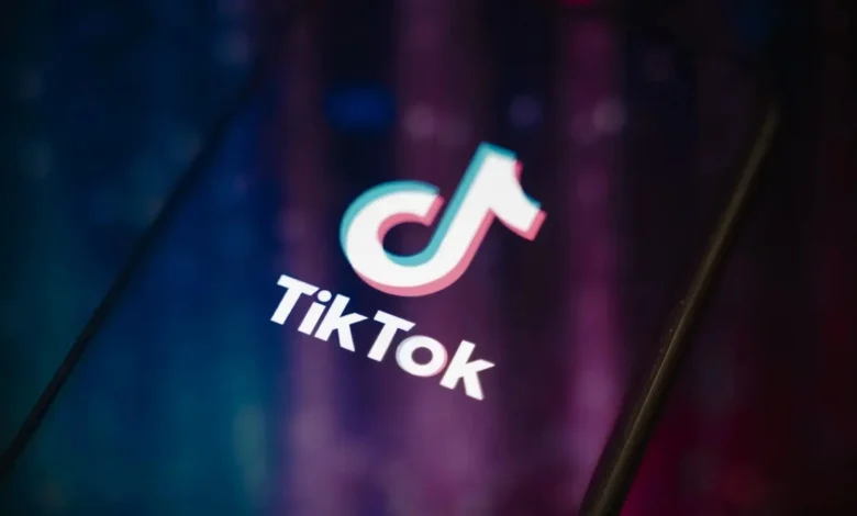
The TikTok logo’s design is simple yet powerful. Its central element is a musical note, representing the platform’s roots in music and sound-based content. The note features a distinctive combination of colors—cyan, magenta, and white—against a dark background, creating a glowing, 3D-like effect. This design captures attention, making the logo instantly recognizable.
The color scheme is not only visually appealing but also symbolic. The neon-like cyan and magenta suggest energy, creativity, and youthful dynamism, reflecting TikTok’s target audience. The black background provides contrast, emphasizing the logo’s vibrancy and making it suitable for various digital platforms and merchandise.
Typography is another key aspect of TikTok’s branding. The platform name is often displayed in bold, clean fonts that complement the musical note icon. This combination reinforces clarity, professionalism, and modernity, while the 3D effect adds depth, enhancing visual engagement.
The logo’s symbolism goes beyond aesthetics. It embodies TikTok’s mission to democratize creativity, inviting users worldwide to express themselves through videos, music, and trends. The simple musical note paired with dynamic color highlights the platform’s playful, inclusive, and innovative nature, making the logo both meaningful and functional in digital marketing contexts.
How to Download and Use the TikTok Logo
Downloading and using the TikTok logo safely requires adherence to official guidelines. The best source for obtaining the logo is directly from TikTok’s brand resources page or official press kits. These sources provide high-resolution images, correct color codes, and clear usage instructions, ensuring that the logo maintains its integrity.
For personal use, the logo can be incorporated into presentations, videos, or social media content, provided it is not altered in a way that misrepresents the brand. Commercial use, such as in marketing campaigns, merchandise, or advertisements, requires careful consideration of copyright and trademark laws. Unauthorized use can result in legal action, so it is crucial to follow TikTok’s guidelines.
Common mistakes include stretching, recoloring, or overlaying text on the logo, which diminishes its visual impact and violates brand rules. Tools such as Adobe Illustrator, Photoshop, or Canva allow designers to integrate the logo seamlessly while maintaining its original proportions and colors.
By using official sources and following best practices, individuals and businesses can leverage the TikTok logo effectively and safely. This ensures both professional quality and compliance with branding standards, while preserving the logo’s identity across multiple media platforms.
TikTok Logo in Marketing and Branding
The TikTok logo plays a pivotal role in marketing and branding strategies. For businesses and creators, it serves as a visual shorthand for the platform’s global recognition and youthful energy. Incorporating the logo into social media campaigns helps establish credibility and association with TikTok’s creative ecosystem.
Successful campaigns often place the logo strategically in content, whether in promotional videos, banners, or influencer collaborations. Proper placement, sizing, and adherence to brand guidelines maximize impact and ensure the logo is instantly identifiable. For example, adding the logo to a corner of a TikTok challenge video reinforces brand visibility without distracting from the main content.
Legal considerations are crucial when using the TikTok logo in marketing. Commercial applications require compliance with TikTok’s intellectual property policies to avoid copyright infringement. By respecting these rules, marketers can safely leverage the logo while benefiting from its global reach and recognition.
Overall, the TikTok logo is not just an icon—it is a branding tool that enhances marketing strategies. Its strategic use strengthens brand alignment, encourages user engagement, and reinforces the platform’s cultural presence worldwide.
Tips and Creative Uses for the TikTok Logo
Creativity is key when incorporating the TikTok logo. Designers can use it in video intros, presentations, merchandise mockups, and digital campaigns while maintaining adherence to brand rules. Customization should focus on context, scale, and background contrast to ensure the logo remains prominent and visually appealing.
Combining the logo with other design elements, such as typography, animations, or color overlays, can create engaging visuals for campaigns or personal projects. However, it is essential to avoid modifying the logo in ways that distort its proportions or brand identity.
Creators and businesses can also explore interactive uses of the TikTok logo. For example, incorporating it in social media stories, animated GIFs, or digital banners encourages engagement and establishes brand presence. Consistency in usage, color scheme, and placement strengthens recognition and enhances professionalism.
By applying these tips, users can maximize the impact of the TikTok logo while respecting its official branding guidelines. This approach ensures the logo remains a powerful symbol of creativity, innovation, and global appeal.
Conclusion
The TikTok logo is more than just a visual element—it represents a global community of creators, music enthusiasts, and social media innovators. Its evolution, distinctive design, and symbolism make it instantly recognizable and a critical tool for branding and marketing.
Understanding how to download, use, and creatively apply the TikTok logo ensures compliance with legal standards while enhancing visibility and engagement. From historical development to modern marketing applications, the logo’s impact on TikTok’s brand identity cannot be overstated. By following best practices and leveraging creative opportunities, both individuals and businesses can benefit from this powerful icon responsibly and effectively.
FAQs
What is the meaning behind the TikTok logo?
The musical note represents TikTok’s roots in music and creativity, while the colors convey energy and vibrancy.
How has the TikTok logo changed over time?
It has evolved from a simple icon to a 3D, neon-like logo reflecting modern design trends.
Where can I safely download the official TikTok logo?
Official brand resources and press kits on TikTok’s website are the safest sources.
Can I use the TikTok logo for commercial purposes?
Yes, but you must follow TikTok’s trademark and branding guidelines to avoid legal issues.
What are the official color codes and fonts for the TikTok logo?
TikTok provides color codes and font guidelines in its brand resources to maintain consistency.
How do I avoid legal issues when using the TikTok logo?
Use official sources, adhere to brand rules, and avoid modifications that misrepresent the logo.
Can I modify the TikTok logo for personal projects?
Minor contextual adjustments are acceptable, but altering proportions or colors is prohibited.
Why is the TikTok logo so recognizable worldwide?
Its distinctive musical note, vibrant colors, and consistent branding make it memorable and globally appealing.
You May Also Read: TikTok Recharge